The StarWars logo is one of the most iconic and recognizable symbols in pop culture. Whether you’re a longtime fan of the Star Wars franchise or a newcomer to the galaxy far, far away, the logo has undergone several changes throughout the years. We’ll talk about how the Star Wars logo has evolved, from its first appearance in 1977 to its modern iterations, and what those changes mean for the franchise’s identity.
How the StarWars Logo Began
![]()
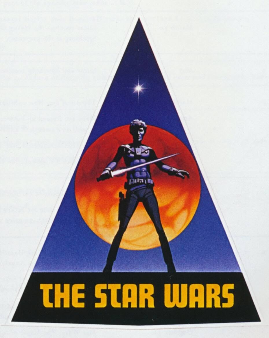
The original Star Wars logo, introduced in 1977, is synonymous with the movie’s groundbreaking success. Designed by the famous artist Suzy Rice, this early logo was a combination of bold, geometric typography with a sense of futuristic flair.
Design Features of the 1977 Logo:
- The words “Star Wars” appeared in a custom sans-serif font with sharp edges, reflecting the film’s sci-fi nature.
- The letters slanted forward, creating a sense of movement and action that matched the film’s excitement.
- A gold or yellow logo on a black background emphasized its bold, memorable appeal.
At the time, this simple yet powerful logo conveyed the groundbreaking nature of the movie. Little did fans know, the Star Wars logo would soon become one of the most recognized symbols in cinematic history. Small design changes, like those made in The Empire Strikes Back, can have a significant impact. Find how similar principles are applied in designing powerful ‘Vs’ logos.
The First Evolution: Empire Strikes Back (1980)
![]()
In 1980, when The Empire Strikes Back was released, the StarWars logo underwent its first significant change. While it retained the core elements of the original design, there were noticeable tweaks.
Changes to the Logo:
- The font became more refined, with a smoother and slightly more rounded appearance.
- The background color was adjusted from the original gold and black to white with some gradients, adding a sense of depth.
- The text was slightly condensed to create a stronger visual presence.
These subtle changes helped reflect the darker and more serious tone of the second movie in the Star Wars saga.
Return of the Jedi (1983) – A More Streamlined Look

When Return of the Jedi hit theaters in 1983, the logo saw another evolution. The changes were minimal, but noticeable to dedicated fans.
Design Features of the 1983 Starwars Logo:
- The text became even bolder, with cleaner lines that emphasized readability.
- The iconic slanted font was kept, but the effect was softened.
- The letters “S” and “W” were now connected in a more stylized fashion, adding a modern flair to the design.
This version of the StarWars logo helped signal the conclusion of the original trilogy and ushered in the franchise’s next chapter.
The Prequel Trilogy (1999-2005) – Modern Touch To Starwars logo
As the Star Wars universe expanded in the late 1990s and early 2000s with the release of the prequel trilogy, the logo underwent a much more dramatic change. George Lucas and his team decided to bring a new look to the iconic brand, aligning it with the modern digital effects of the time.
Changes in the Prequel Logo:
-
- A thinner, more stylized font reflected the polished aesthetics of the prequels.
- The letters received a 3D treatment, adding a futuristic dynamic.
- Blue and silver replaced the classic gold, matching the vibrant visuals of the films.
This fresh look resonated with a new generation, highlighting the technological leaps seen in The Phantom Menace and its sequels.
The Sequel Trilogy (2015-2019) – A Return to the Classic

The Star Wars logo returned to its roots with The Force Awakens in 2015 but incorporated modern elements. Designers struck a balance between nostalgia and innovation.
Design Features in the Sequel Trilogy:
- Gold lettering made a comeback, evoking memories for long-time fans.
- The font received sharper edges for a streamlined look.
- Uniform letter sizes replaced the dynamic slants of previous iterations.
This blend of classic and modern elements reflected the balancing act of the sequel trilogy, which aimed to honor the past while creating something new for a new generation of Star Wars fans.
The Mandalorian and Beyond – Simplified for the Digital Age

With the rise of streaming services like Disney+, the Star Wars logo adopted a minimalist approach tailored for digital platforms.
Design Features of the New Starwars Logo:
- A thinner font with more spacing improved readability on small screens.
- Muted gold and black tones replaced earlier vibrant colors.
- The logo’s simplicity made it perfect for mobile devices and modern branding.
This design aligns with today’s minimalist trends while ensuring universal recognition across devices.
Why the StarWars Logo Keeps Evolving
The Star Wars logo has changed significantly over the years, but these transformations are not just about aesthetic preferences. The changes reflect the evolution of the Star Wars franchise itself and the changing tastes of audiences. As the saga has expanded into new media formats—film, television, books, and more—the logo has adapted to fit the different technological and cultural contexts in which it exists.
Each redesign serves a specific purpose, whether it’s to appeal to a new generation of fans, to reflect the advancements in visual effects, or to tie into the changing storytelling tone of each new Star Wars film.
Star Wars Logo and Its Impact on Pop Culture
The StarWars logo is more than just a symbol of a movie franchise. It’s a cultural icon. The logo itself has become synonymous with epic storytelling, adventure, and imagination. It represents not just the films but the entire Star Wars universe, which includes TV series, books, comics, video games, and merchandise.
From T-shirts and posters to fan art and merchandise, it has left an indelible mark on pop culture, influencing design, fashion, and advertising. From collectibles to fan art, the Star Wars logo has inspired countless creations. You can find some of these on the official Star Wars store
Conclusion: The Everlasting Legacy of the StarWars Logo
From its bold, simple design in 1977 to its sleek, modern look. The StarWars logo has continuously evolved to reflect the franchise’s growth. Each change has mirrored the times, whether technological advancements, storytelling shifts, or audience expectations. Despite these changes, the logo remains as iconic and memorable as ever. Forever tied to one of the greatest cinematic franchises in history.
The Star Wars logo stands as a reminder of the power of design to convey a sense of adventure, mystery, and excitement. Whether you’re watching A New Hope for the first time or catching up with the latest Star Wars series. The logo will always be there to remind you that the force will be with you always.